


The ggtime package extends the capabilities of ‘ggplot2’ by providing grammatical elements and plot helpers designed for visualizing time series patterns. These functions use calendar structures implemented in the mixtime package to help explore common time series patterns including trend, seasonality, cycles, and holidays.
The plot helper functions make use of the tsibble data format in order to quickly and easily produce common time series plots. These plots can also be constructed with the underlying grammar elements, which allows greater flexibility in producing custom time series visualisations. The examples below cover both: plot helpers first, then the grammar elements they’re built from.
You can install the stable version from CRAN:
install.packages("ggtime")You can install the development version of ggtime from GitHub with:
# install.packages("remotes")
remotes::install_github("mitchelloharawild/ggtime")
Plot helper functions turn a tsibble into a complete time series graphic in one call, such as a time plot or a seasonal plot. They’re quick to use, but only offer as much customisation as their arguments allow.
The simplest time series visualisation is the time plot, which shows
time continuously on the x-axis with the measured variable on the
y-axis. This is useful for identifying patterns that persist over a long
period of time, such as trends and seasonality. autoplot()
creates a time plot directly from a tsibble.
library(ggtime)
library(ggplot2)
library(tsibble)
library(dplyr)

tsibbledata::aus_production |>
  autoplot(Beer)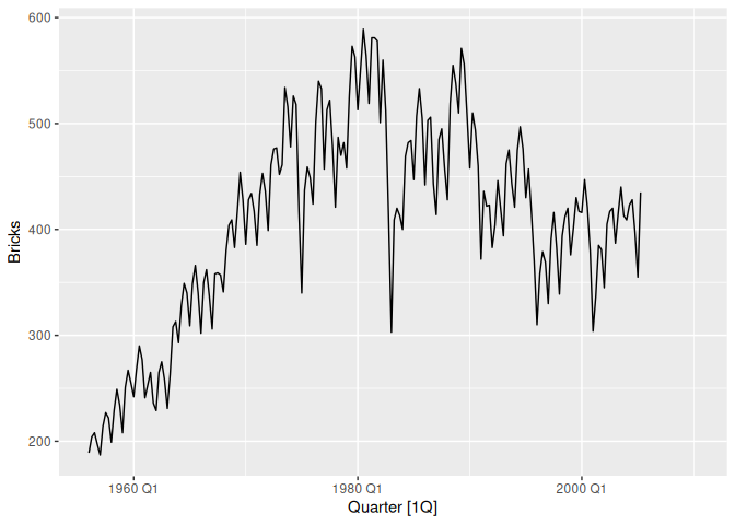
To see the shape of the annual seasonal pattern, it’s more useful to
show time cyclically on the x-axis, making it easier to identify the
peaks, troughs, and overall shape of the seasonality.
gg_season() creates this seasonal plot from a tsibble.
tsibbledata::aus_production |>
  gg_season(Beer)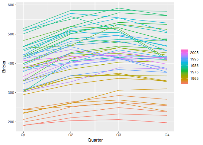
ggtime includes several other plot helpers for exploring and
diagnosing time series. gg_subseries() and
gg_lag() show seasonal changes over time and relationships
with past values; gg_arma() and gg_irf() plot
characteristic ARMA roots and impulse response functions; and
gg_tsdisplay()/gg_tsresiduals() combine
several of these into a single ensemble for exploring a series or
diagnosing a model’s residuals.
autoplot()/autolayer() extend beyond tsibbles
too, dispatching on the model output from the fable/feasts ecosystem to
plot forecasts and their prediction intervals (fbl_ts), the
components of a decomposition (dcmp_ts), and
auto-/cross-correlation results (tbl_cf).
For full control over a time series plot’s appearance, ggtime’s grammar extensions add time-aware geoms, scales, and coordinate systems that behave like any other ggplot2 component. Use them to combine layers, apply your own themes and colour scales, and build visualisations the plot helpers don’t cover.
geom_time_line() is a time-aware extension of
ggplot2::geom_line() that keeps a line’s slope an accurate
reflection of the rate of change, even across timezone changes, gaps,
and duplicated time points.
tsibbledata::aus_production |>
  ggplot(aes(x = Quarter, y = Beer)) +
  geom_time_line(colour = "steelblue")
scale_x_mixtime() is the position scale behind every
mixtime time axis, applied automatically whenever a mixtime
vector is mapped to a plot. It maps time points of different
granularities onto one shared axis, as shown below with quarterly and
annual Beer production drawn together, and takes calendrical durations
for breaks (time_breaks) and calendar-aware format strings
for labels (time_labels).
aus_beer <- tsibbledata::aus_production |>
  as_tibble() |>
  transmute(Quarter = mixtime::yearquarter(as.Date(Quarter)), Beer)

aus_beer_annual <- aus_beer |>
  group_by(Quarter = mixtime::year(Quarter)) |>
  summarise(Beer = mean(Beer), .groups = "drop")

bind_rows(
  quarterly = aus_beer,
  annual = aus_beer_annual,
  .id = "granularity"
) |>
  ggplot(aes(Quarter, Beer, colour = granularity)) +
  geom_time_line() +
  scale_x_mixtime(time_breaks = mixtime::years(10L))
coord_loop() loops the time axis around a calendrical
period, so a continuous time axis can be compared cyclically instead of
being discretised into a seasonal factor. Looping the time plot yearly
reveals the same seasonal shape as the seasonal plot above, built
entirely from grammar.
aus_beer |>
  ggplot(aes(x = Quarter, y = Beer)) +
  geom_time_line(colour = "steelblue") +
  coord_loop(time_loops = mixtime::years(1L))
coord_calendar() arranges time into a calendar-like grid
of rows and columns, useful for visualising events over short intervals
within a long time span, such as holidays. Arranging hourly pedestrian
counts into a weekly calendar reveals a surge in activity at one sensor
during the Australian Open in late January.
tsibble::pedestrian |>
  mutate(Time = mixtime::datetime(Date_Time)) |>
  filter(Time < mixtime::datetime("2015-02-01 00:00:00")) |>
  ggplot(aes(x = Time, y = Count, colour = Sensor)) +
  geom_line() +
  coord_calendar(rows = mixtime::weeks(1L), cols = NULL) +
  theme(legend.position = "bottom")